Poe & Co. are a team of Michelin-trained chefs with the vision of elevating packaged camp meals. They craft 100% vegan meals in small batches by focusing on clean superfood ingredients, robust flavor, and functionality.
Poe & Co. reached out to me to develop a visual identity and packaging system for their Folk Foods line of camp meals. Their vision was to stand out from other dried meals by putting emphasis on natural ingredients and nostalgic experiences in the outdoors. While big macro-counting brands cater to the technical through-hikers, Poe & Co. speaks to the wider range of folks: the weekend warriors looking for an excellent dining experience without any fuss.


PROCESS
CONCEPTS
Using initial sketches and mood boards, we explored different concepts, layouts, and visual elements. Each concept put a unique messaging point at the forefront of the design.


DEVELOPMENT
Ultimately, Concept One was chosen for further development.
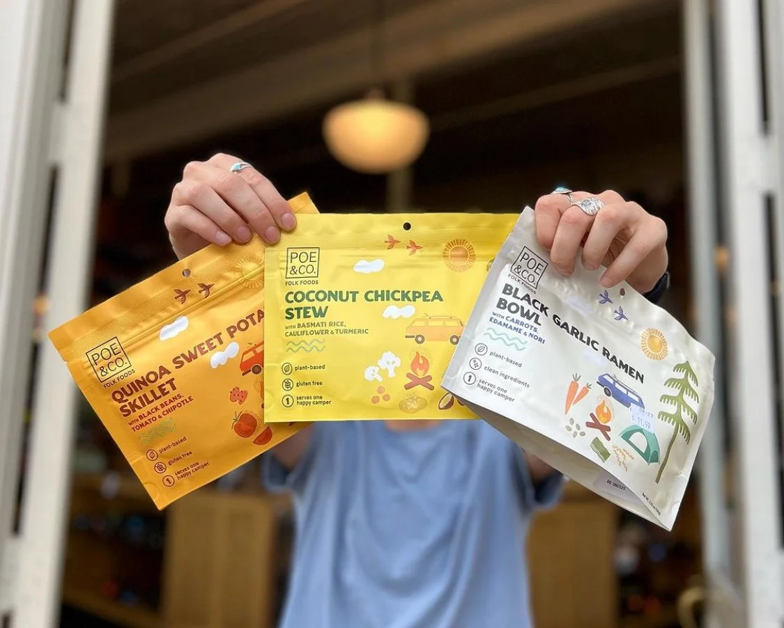
This concept combined structured and clear typography with a collage of natural, fun, loose-lined illustrations. The images are more conceptual than literal and include both outdoor/environmental elements as well as food ingredients. The images invoke a fresh aesthetic while also informing the customer about flavor profile and ingredients. It is at once both playful and organized; adventurous and pragmatic.

The concept went through rounds of refinement.


FINAL PRODUCT
The design was finalized and applied across all 3 SKUs.